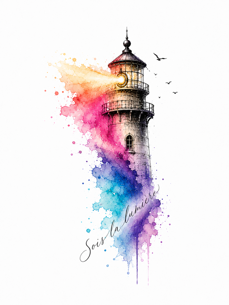
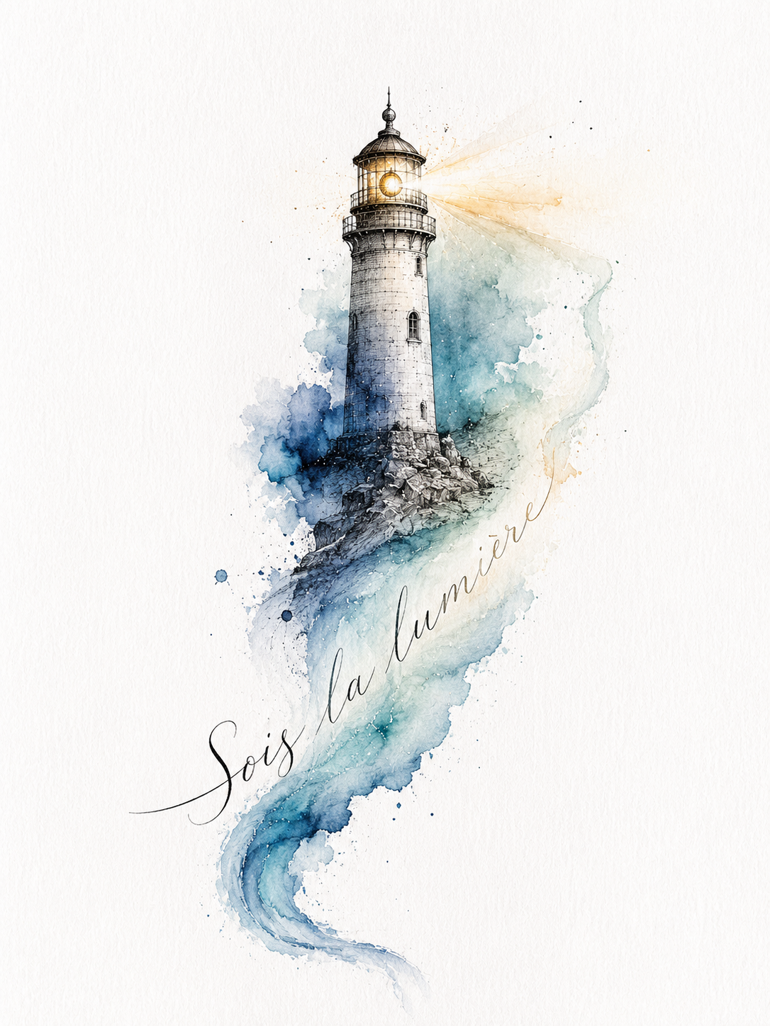
Keep the previous result exactly the same, but refine only the size and placement of the lettering.
Make the phrase "Sois la lumière" smaller and more delicate. The text should fit entirely within the lower horizontal watercolor flow and should not extend beyond the watercolor shape.
The lettering should follow only the existing lower watercolor line, staying close to the base of the lighthouse. Do not let the phrase rise too far upward or occupy the open space around the lighthouse.
The calligraphy should feel like a subtle handwritten detail within the artwork, not a main element. Keep the elegant fine fountain pen style, natural handwritten imperfections and the gradual transition from black ink into watercolor.
The words should appear gently carried by the watercolor flow, with enough empty space around the lighthouse to preserve the original composition.
Do not change the lighthouse, watercolor colors, original design, proportions or style. Only reduce the lettering size and keep it contained within the lower watercolor area. he phrase should be approximately 25–30% smaller than in the previous version.