Image - 2026-10-12 13:36
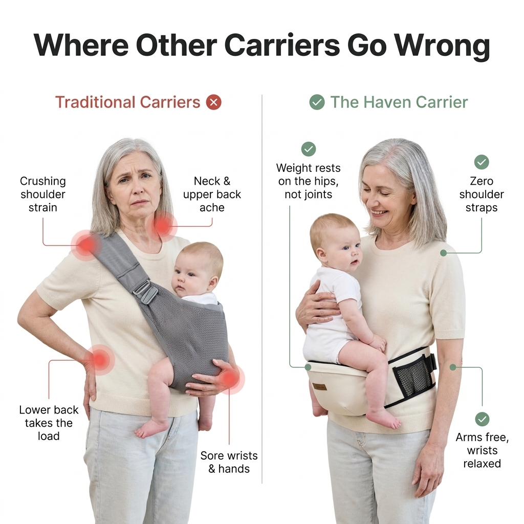
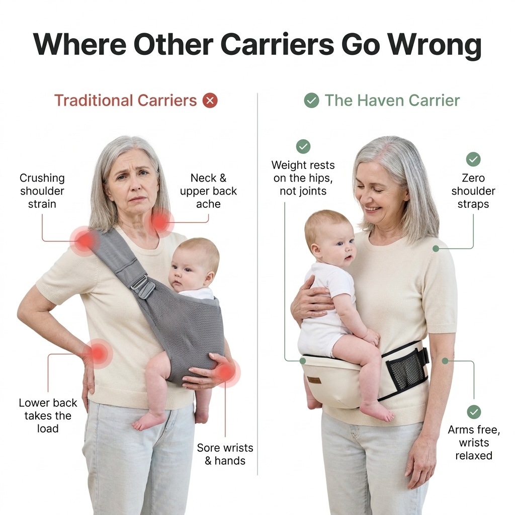
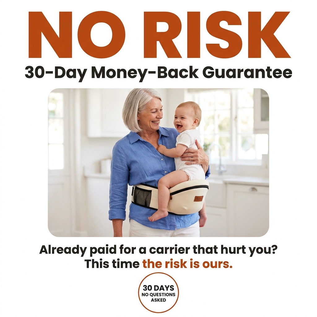
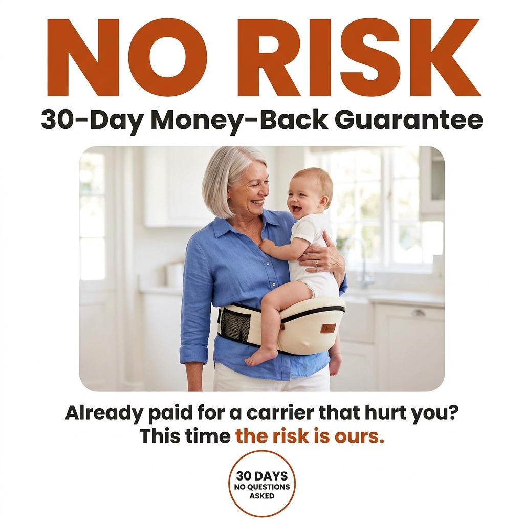
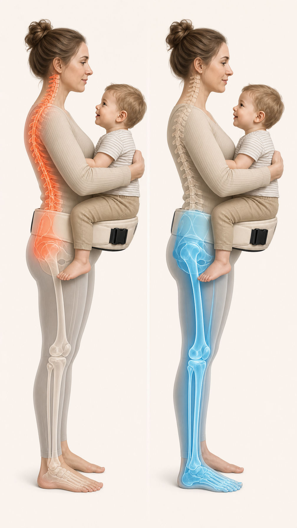
Create a 1:1 square e-commerce product comparison image (2048x2048) on a pure, plain white background ( #FFFFFF). No gradients, no scenery, no props. The style is clean, premium and minimalist, like a high-converting Amazon or Shopify product page infographic. TITLE (top of image, spanning the full width): Large, bold, modern sans-serif headline in dark charcoal ( #1F1F1F) that reads exactly: “Where Other Carriers Go Wrong”. The title takes up roughly the top 18% of the image. It should be the most dominant text element, perfectly legible, with even letter spacing and no typos. LAYOUT: Below the title, split the image into two equal vertical halves with a thin, light grey divider line down the centre. Above each half, add a small label: Left label: “Traditional Carriers” in muted red ( #C0392B) with a small ✕ icon Right label: “The Haven Carrier” in soft sage green ( #5B8C6E) with a small ✓ icon LEFT SIDE – Traditional carrier: A warm, kind-looking grandmother in her early 60s with silver-grey shoulder-length hair, light natural makeup, and a plain cream knit top with light jeans. She is shown from the thighs up, standing, wearing the single-shoulder baby sling from Image 2, with a baby around 8–10 months old (realistic, calm, facing her chest). Her expression is tired and uncomfortable: furrowed brow, tight lips, a slight wince. Her posture is strained, with one shoulder pulled down by the strap, her head tilted forward, a slight hunch in her upper back, and one hand propping up the baby’s weight from underneath. Overlay 4 pain-point markers on her body. Each is a soft, glowing red circle (semi-transparent, like a heat spot) with a thin line leading out to a short label in clean dark text: Shoulder: “Crushing shoulder strain” Neck: “Neck & upper back ache” Lower back: “Lower back takes the load” Wrist/hand under the baby: “Sore wrists & hands” RIGHT SIDE – Haven hip carrier: The exact same grandmother, with the same face, hair, and outfit for perfect consistency. She is wearing the hip seat carrier from Image 1, buckled around her waist, with the same baby seated comfortably on the hip seat on her side. She stands upright with relaxed shoulders, open posture and a genuine, warm smile, looking down at the baby or lightly toward the camera. Her free hand rests gently on the baby’s back. She looks content, light and pain-free. Do not show any red markers on this side. Instead, add 3 small sage-green check-mark callouts with thin lines pointing to the relevant areas: Waist/hip seat: “Weight rests on the hips, not joints” Shoulders: “Zero shoulder straps” Arm/hand: “Arms free, wrists relaxed” PHOTOGRAPHY & STYLE: Photorealistic studio photography with soft, even, diffused lighting and gentle natural shadows beneath the figures only. Both figures are the same size and aligned at the same height for a fair side-by-side comparison. Natural, realistic skin texture appropriate for a woman in her 60s (fine lines, not airbrushed). Use the same colour family for both outfits so the only visual difference is the carrier and her comfort. Keep the products accurate to the reference images: the hip seat in cream/off-white with black trim and a mesh side pocket, and the sling in grey mesh. Remove any visible brand logos or labels from both products. All text must be crisp, correctly spelled and legible at mobile size, with generous white space around every element. AVOID: cluttered backgrounds, extra people, distorted hands or extra fingers, an unsafe baby position, cartoon style, exaggerated agony, text misspellings, watermarks.
Free to start · Generate videos and images with AI in seconds
More from this creator
More Fast gen images
См. все →